The Graphics
History of Unum. By Bob Anastasoff
This article traces the use of
images and logos of Unum using the Union Mutual Life
Insurance Company lineage
since its inception in 1848 to its most
recent change in April 2007.
The
following were used as
sources:
* Cheryl Chouiniere, Archivist at The History Factory in Chantilly VA;
* Sheila Coyne, Eileen Farrar and Renee Amadore-Thomes at Unum;
* A Maine Heritage. The History of
the Union Mutual Life Insurance Company.
by George S. Jackson; Portland, Maine, 1964.
The images and logos are
presented with an estimate of the span of years the image or logo
was used.
Where available,
background information is given on the influences on design.
1848.
Union Mutual Life Insurance Company is founded.
 |
1849-1941.
Union Mutual's first business was
actually done in 1849,
the year of the Gold Rush.
The first use of an image/logo was
the Seal of Maine.
This emphasized that fact that
Union Mutual was a Company
formed in Maine.
The use of the Seal of Maine
continued until 1941. |
 |
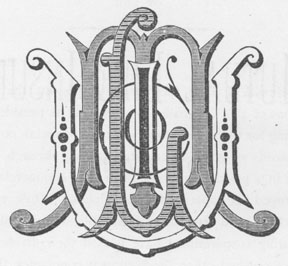
1878-1879.
Union Mutual had financial troubles in
the 1870's.
There was a great depression in 1873.
Union Mutual constructed their own
building in Boston
in 1876.
A major reorganization occurred in
1876-1877.
Union Mutual moved its headquarters
from Boston
to Portland in 1881. |
|

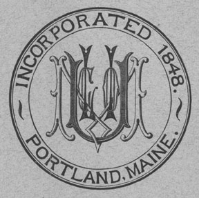
1887. |

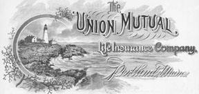
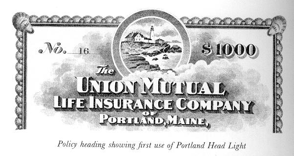
1896-1918.
Beginning as far back as 1896, there had
been an
increasing tendency to use as symbol an
engraving
of the lighthouse built on Portland Head.
|

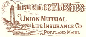
1929-1935.
In 1934, Rolland Irish, then President of
Union Mutual, suggested to the Board of
Directors that the Company adopt the
Portland Head Light as the Company’s symbol. |

1935-1937. |

1938-1941. |

1941.
For many years before 1941 (since 1896) the old lighthouse
on its solid rock foundation had been associated in the public
mind with the reliability of the Union Mutual.
With the passage of a Maine law in 1941
forbidding use
of the State Seal for private
purposes, the Portland Head
Light was adopted as the official Company logo. |

1941-1955. |

1956-1967. |

1967-1969. |

1970-1985. |
A new business mission was adopted in 1970 to present
the Company as “an
aggressive, fast-growing, modern
organization,” with a new “modern abstraction of the
Portland Headlight” as the logo.
Later in 1970, President Colin Hampton announced
a new corporate identification program and the
adoption of the Unionmutual name.
January
11, 1985 UNUM Corporation
was organized
under Delaware law for the purpose of holding all of the
outstanding stock of Unionmutual after the conversion. |

1986-1993. |
The stock conversion took place in November 1986.
The name of the Company was changed to UNUM
Life
Insurance Company, owned by the publicly held UNUM
Corporation (NYSE: UNM). |

1993-1999. |

The tag line was added
soon
after the introduction of this logo.
|

1999-2001. |
Provident and Unum merged in 1999.
The
Company name became UnumProvident.
The tag
line changed to emphasize income protection. |

May 10, 2001
- 2002
A new brand name and logo is launched.

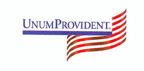
January 14, 2002 - 2007
UnumProvident introduces its four-stripe
logo refinement. The previous logo had
too many stripes and didn't fit into marketing
and other materials/forms.
|
The UnumProvident logo reflected the strength and
flexibility of the three leadership companies
–
Provident, Unum and Paul Revere.
UnumProvident now had a business model that
reflected the future needs of customers rather than
the market place traditions of these three companies. The previous strategy of
using UnumProvident Corp
on all holding-company material and Unum with the
lighthouse as its marketing brand created some
confusion in the marketplace. The
new mark was
used for both the holding company and the marketing
brand in North America. GENEX and
Colonial
maintained their own logos.
|

April 2007 - |
Unum introduced its present logo in April 2007.
It also introduced a new tagline "Better Benefits at Work."
The dots over three of the letters in the logo are intended to
invoke the image of three people, representing the company's
emphasis on three groups:
1. Unum's Customers, which are companies that provide
Disability Insurance and other benefits to
employees;
2. The Employees of Those Companies;
3. Unum's Own Workers.
The new tagline, "Better Benefits at Work," is supposed to
convey that Unum offers more than just Disability Insurance.
The "at work" reference intentionally creates a double
meaning: improved benefits at the workplace and benefit
packages that are working for those covered by Unum's
insurance and other products. |
The Seal of Maine was used as the
Company's logo for over 90 years (1849-1941).
The Lighthouse was officially used as the Company's logo for a lesser 60 years
(1941-2001).
It should be anticipated that the new logo will be used for a considerably
shorter time due
to the
evolution of the marketplace, ever-shortening product/market life cycles, the
Company's evolving
strategies
and business models and further mergers.

